Tuesday, November 9, 2010
Thursday, October 21, 2010
Thursday, September 30, 2010
Wednesday, September 22, 2010
Monday, August 30, 2010
Life drawings studies
Tuesday, August 17, 2010
More sketches from my pad
Tuesday, August 10, 2010
Benhur thumbnail studies
The camera pans as the soliders on horses pass by a little shop of a carpenter, which is cleverly used as a motivation for the camera to frame the villager in the window. A great silhouette of the figure is frame in the middle of the shot for the audience to immediately focus. There are strong darks and cools which help enforce the silhouette of the man, by further staging his body within another window, to get the contrast of dark against light. The edit uses the Soldiers in the foreground to not only establish scale in the shot, but as a wipe, as the horse were used to motivate the pan for a wipe.

The wipe and staging help bring the audience to focus on this new character introduced into the plot. The Light setup (possibly a kicker) to highlight the actors face to establish a connection to the actor.

The wipe and staging help bring the audience to focus on this new character introduced into the plot. The Light setup (possibly a kicker) to highlight the actors face to establish a connection to the actor.
Cut back to a wide shot, utilizing silhouettes to establish design in the shot, by use of space and to initiate the scene between the two villagers. The soldiers are contrasted with the light from the sun, while the carpenter is in silhouette to help reinforce a sense of space and separation. The device effectively moves the audience to the point of view of the carpenter, but helps relay the story of the marching soldiers without causing confusion by just haphazardly focusing ion this new figure in the story. A third figure is established in the shot by super imposing him in-between the carpenter and the soldiers, a visual cue to draw the audiences attention to this figure. Great blocking with in this sequence for establishing character blocking, and moving from a large over view of space for the soldiers marching, to a more intimate setting within the carpenters shop. The tree cuts have effectively moved the viewer away from the marching soldiers, to the story of this carpenter working while this huge event is happening within his village. There is no time spent establishing the interior of the carpenter's shop, so as to not have the audience become to invested in the characters. The moment serves as a story telling device to help establish the era the film, by the iconic reference.
Except for the close up shot,all the shots thus far are more outdoor established light. There is a difference when comparing the light set up -vs- the natural light from out door, In terms of temperature captured, but extremely effective lighting to get the audience to look exactly where the director,cinematographer and production designer wanted the audience to look.
Friday, July 30, 2010
Grand Marnier commercial
Here is a commercial, which I had contributed some animation to a couple of shots. Some shots were done traditionally, and cleaned up in flash. The majority of the shots were animated using flash, and photoshop.
Thursday, July 15, 2010
Pretty Swamped, but I wanted to post some sketch book drawings
Friday, July 9, 2010
I had started to play with Painter
Saturday, July 3, 2010
More Sketch booksketches
I am glad, these people stuck around at the table long enough to get a good study for myself.


The two sketches below, I seized the moment and used a Tombo brush marker, as well as other rendering marks to indicate shadow,depth and texture at Stir Crazy cafe. This could go good or bad all the time. It's different than adding the tone in Photoshop under a controlled environment.
Friday, July 2, 2010
Doodle Page from sketch group meet at Coffee shop
Wednesday, June 23, 2010
Ben-Hur studies
In an attempt to make this more interesting , I am now going to explain some of the observations I am making while studying the shots from Ben-Hur. I definitely encourage feedback and/or input from any one taking the time to read these entries on my blog.
I have drawn these as thumb nails as opposed to screen grabs, in order to exercise my problem solving while sketching the shot. In order to practice little techniques for drawing cinematography, lighting and staging of actors and objects in the shot. I am posting the previous thumbnails to finish talking about the shot, so I can move on to new thumbnails.

 The shots are a continue to build up the vast size of the Roman Empire through a succession of shots. The use of deep space within the shots are used as a tool to help support the armies size. As the shots proceed, we as an audience are being drawn in closer to the shots by the order of the shots. These shots were all outside, so there is less control of the lighting for these shots versus a stage environment.
The last thumbnail represents a panning shot with the horse being used a wipe for the shot in a way (very clever).
These shots do not get into the meat of the story, as we as a viewer are still being acclimated into the world.
I have drawn these as thumb nails as opposed to screen grabs, in order to exercise my problem solving while sketching the shot. In order to practice little techniques for drawing cinematography, lighting and staging of actors and objects in the shot. I am posting the previous thumbnails to finish talking about the shot, so I can move on to new thumbnails.

 The shots are a continue to build up the vast size of the Roman Empire through a succession of shots. The use of deep space within the shots are used as a tool to help support the armies size. As the shots proceed, we as an audience are being drawn in closer to the shots by the order of the shots. These shots were all outside, so there is less control of the lighting for these shots versus a stage environment.
The last thumbnail represents a panning shot with the horse being used a wipe for the shot in a way (very clever).
These shots do not get into the meat of the story, as we as a viewer are still being acclimated into the world.
Thursday, June 17, 2010
I love this packaging design


I really dig this packaging design for the box cover art and Logo for these games. I am a big Night of the Living Dead/Dawn of the Dead fan. This design captured the essence of the two films. The shape of the fingers lead right into the logo, the color contrast directs my eye right to the hand, and right up to the fingers. Great use of Repetition with variation. Personally I would love to meet the designer/designers responsible for this designs. Great job!!!
A couple of Quick sketches


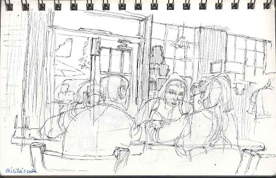
These are a bunch of quick sketches I complied together from standing on line to sitting drinking coffee and reading, taking a the time to capture some real life. I am trying to maintain a level of consistency,while trying to experiment with graphic results from the various lines put down.
As I make time to scan more sketches into photoshop, I will post more observational sketches.
Tuesday, June 15, 2010
My Website
I have published my website, although alot of it is under construction, but it's up finally
Click the Website link on the sidebar for viewing pleasure.
Click the Website link on the sidebar for viewing pleasure.
Tuesday, June 1, 2010
Sunday, May 30, 2010
Subscribe to:
Comments (Atom)


