Here is a commercial, which I had contributed some animation to a couple of shots. Some shots were done traditionally, and cleaned up in flash. The majority of the shots were animated using flash, and photoshop.

Friday, July 30, 2010

Thursday, July 15, 2010
Pretty Swamped, but I wanted to post some sketch book drawings
I have been pretty busy... but I found a minute to post some sketches.
Yes, I sketch some times during life drawing breaks,( in reference to the 1st drawing) but I try not to be that anti social, but I like to get a quick sketch in or two :)


Yes, I sketch some times during life drawing breaks,( in reference to the 1st drawing) but I try not to be that anti social, but I like to get a quick sketch in or two :)


Friday, July 9, 2010
I had started to play with Painter
 I have started to play with painter to compare it to photoshop. So far I like the intuitiveness with painter compared to photoshop. The only advantage with photoshop is the length of time which I have been using it.
Saturday, July 3, 2010
More Sketch booksketches
I am glad, these people stuck around at the table long enough to get a good study for myself.
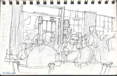


I was more comfortable with my pen this day. I always try to add indications of the environment, and to get a sense of the feel of the place.


For anyone visiting my blog, thanks for checking out my stuff. There are more sketches to come in the future.

The two sketches below, I seized the moment and used a Tombo brush marker, as well as other rendering marks to indicate shadow,depth and texture at Stir Crazy cafe. This could go good or bad all the time. It's different than adding the tone in Photoshop under a controlled environment.


I was more comfortable with my pen this day. I always try to add indications of the environment, and to get a sense of the feel of the place.


For anyone visiting my blog, thanks for checking out my stuff. There are more sketches to come in the future.
Friday, July 2, 2010
Doodle Page from sketch group meet at Coffee shop

Page sketch at coffee shop meeting with sketch group. I posted it because it''s done on a loose leaf paper, and I would probably just end up loosing it.
Wednesday, June 23, 2010
Ben-Hur studies
In an attempt to make this more interesting , I am now going to explain some of the observations I am making while studying the shots from Ben-Hur. I definitely encourage feedback and/or input from any one taking the time to read these entries on my blog.
I have drawn these as thumb nails as opposed to screen grabs, in order to exercise my problem solving while sketching the shot. In order to practice little techniques for drawing cinematography, lighting and staging of actors and objects in the shot. I am posting the previous thumbnails to finish talking about the shot, so I can move on to new thumbnails.

 The shots are a continue to build up the vast size of the Roman Empire through a succession of shots. The use of deep space within the shots are used as a tool to help support the armies size. As the shots proceed, we as an audience are being drawn in closer to the shots by the order of the shots. These shots were all outside, so there is less control of the lighting for these shots versus a stage environment.
The last thumbnail represents a panning shot with the horse being used a wipe for the shot in a way (very clever).
These shots do not get into the meat of the story, as we as a viewer are still being acclimated into the world.
I have drawn these as thumb nails as opposed to screen grabs, in order to exercise my problem solving while sketching the shot. In order to practice little techniques for drawing cinematography, lighting and staging of actors and objects in the shot. I am posting the previous thumbnails to finish talking about the shot, so I can move on to new thumbnails.

 The shots are a continue to build up the vast size of the Roman Empire through a succession of shots. The use of deep space within the shots are used as a tool to help support the armies size. As the shots proceed, we as an audience are being drawn in closer to the shots by the order of the shots. These shots were all outside, so there is less control of the lighting for these shots versus a stage environment.
The last thumbnail represents a panning shot with the horse being used a wipe for the shot in a way (very clever).
These shots do not get into the meat of the story, as we as a viewer are still being acclimated into the world.
Thursday, June 17, 2010
I love this packaging design


I really dig this packaging design for the box cover art and Logo for these games. I am a big Night of the Living Dead/Dawn of the Dead fan. This design captured the essence of the two films. The shape of the fingers lead right into the logo, the color contrast directs my eye right to the hand, and right up to the fingers. Great use of Repetition with variation. Personally I would love to meet the designer/designers responsible for this designs. Great job!!!
Subscribe to:
Posts (Atom)